Luxury perfume product shot
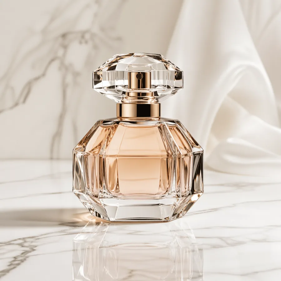
Commercial photo of a tall amber perfume bottle on white marble, macro lens, soft studio softbox, premium reflection, clean light gray background, room for caption on the right, no text, no logos.
Showcase
A curated 2026 showcase of GPT Image 2 examples across product photography, campaign visuals, editorial illustration, portrait concepts, abstract graphics, social ads, and architecture — each paired with the production-ready prompt that generated it.
Examples
Use these examples as practical starting points for campaign visuals, product work, editorial images, and creative direction.
Commercial photo of a tall amber perfume bottle on white marble, macro lens, soft studio softbox, premium reflection, clean light gray background, room for caption on the right, no text, no logos.
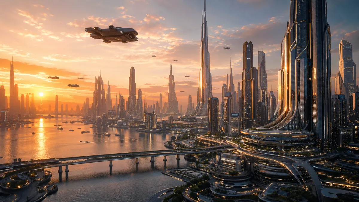
Wide homepage hero image of a futuristic glass-tower city at sunset, cinematic wide shot, golden hour rim light, strong negative space in the upper sky, ready for headline overlay, realistic detail, no words in image.
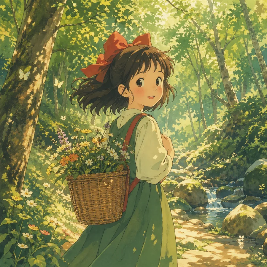
Warm anime-style illustration of a small forest clearing at golden hour, soft watercolor tones, atmospheric haze, single character pose readable at small sizes, balanced composition, room for title overlay at the top, no text.
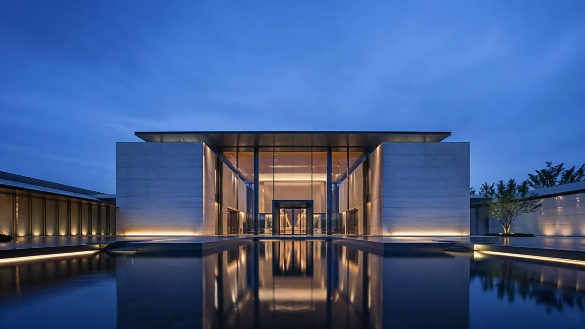
Modern architecture exterior of a glass-and-concrete pavilion at midday daylight, three-quarter angle, realistic materials, sharp shadows, editorial composition, premium real estate photography style, no people, no logos.
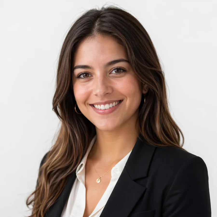
Editorial portrait of a confident mid-thirties founder, neutral light gray background, soft window light from camera left with subtle rim from the right, three-quarter angle, shallow depth of field, natural skin tones, no typography.
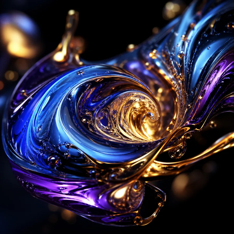
Abstract liquid metal shapes in deep blue and brushed gold, macro detail, high contrast, dark background, premium presentation cover style, balanced composition, no text in image.
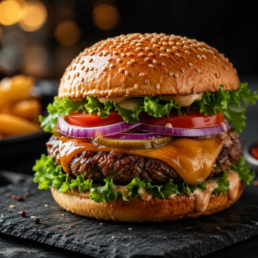
Professional food photography of a gourmet burger on a dark slate board, side lighting, crisp texture, shallow depth of field, appetizing editorial composition, no text, no logos.
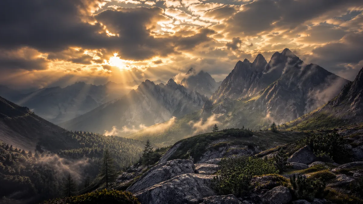
Cinematic mountain valley at golden hour, dramatic clouds, wide landscape framing, natural light rays, high-detail travel campaign style, room for headline overlay, no text.
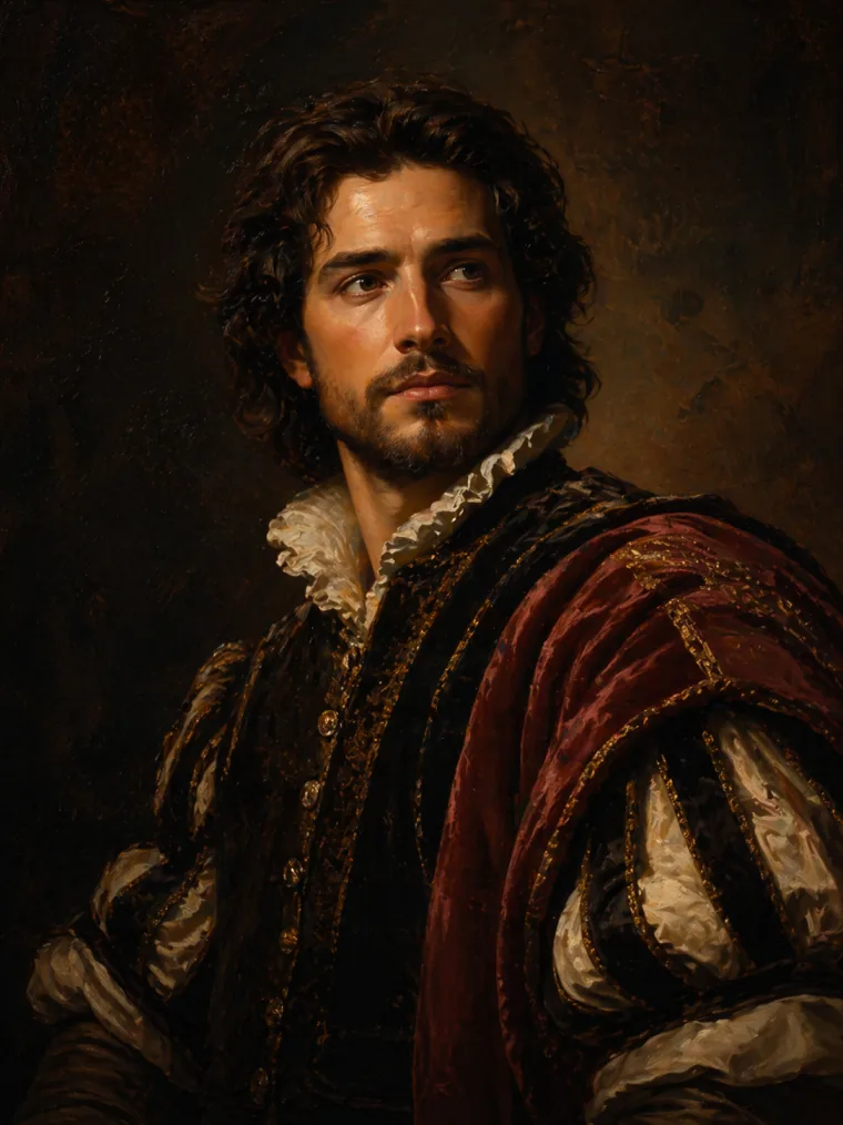
Classical oil painting portrait with rich warm tones, visible brush strokes, dramatic museum lighting, editorial cover composition, premium art direction, no embedded text.
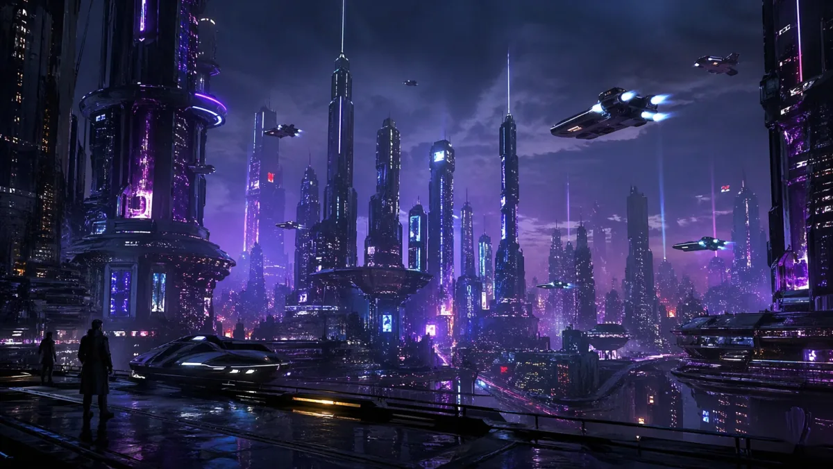
Futuristic sci-fi city at night, neon skyscrapers, flying vehicles, dramatic blue and purple lighting, cinematic concept art framing, high contrast, no text.
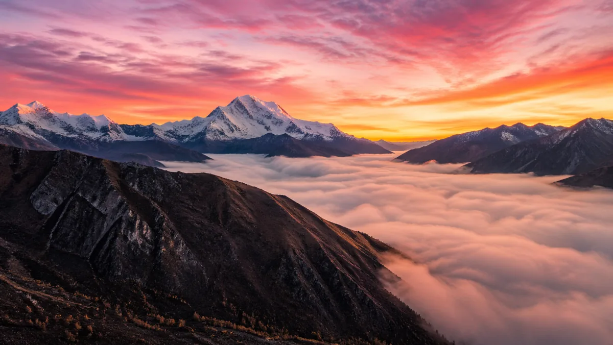
Breathtaking mountain sunrise with pink and orange sky, snow-capped peaks, low cloud layer, drone perspective, epic wide angle, photoreal travel campaign image.
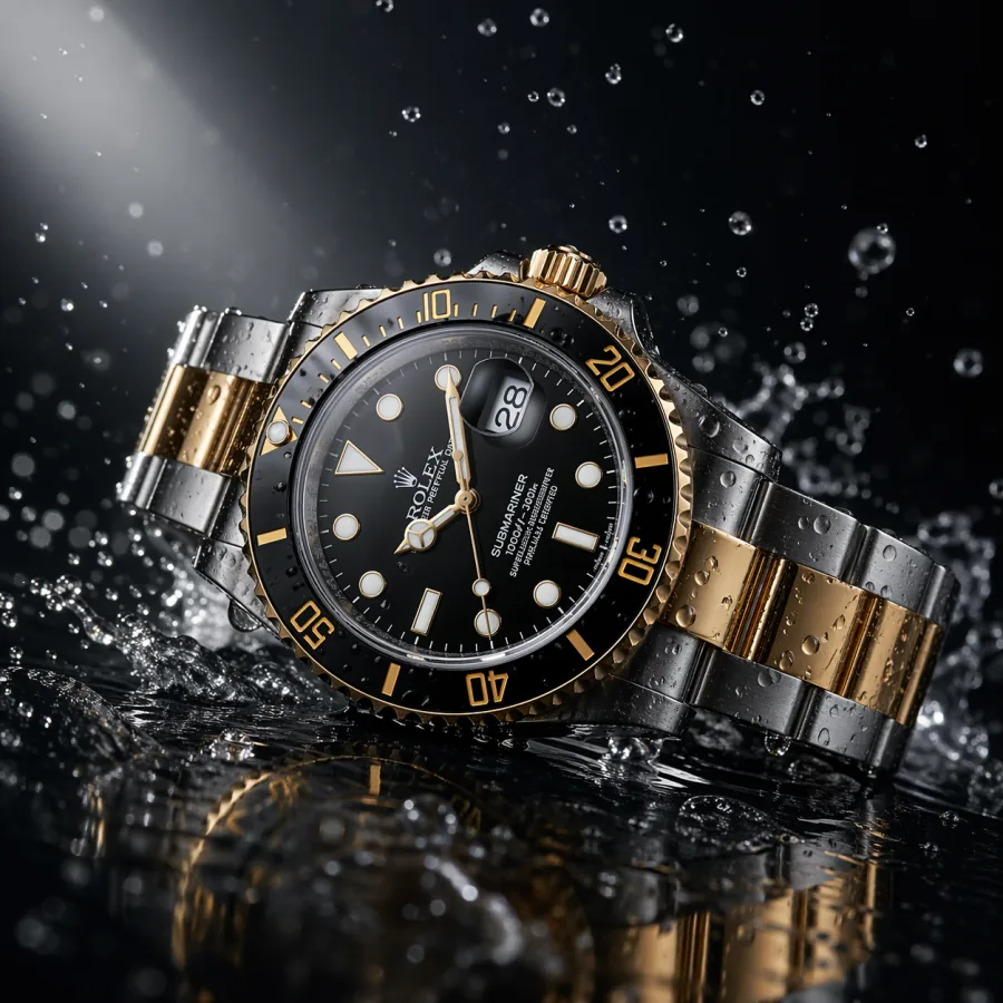
Luxury wristwatch on a dark reflective surface, water droplets splashing around it, dramatic spotlight, macro lens, ultra-sharp commercial product photography, no text.
How to read it
A useful showcase should help you judge production fit, not just aesthetic taste. As you scroll, look at composition, detail quality, subject control, background usefulness, and whether each image could realistically slot into a layout you ship.
Product examples test whether the generator can create clean surfaces, controlled reflections, premium lighting, and enough negative space for ecommerce, ads, and product page layouts. Look for natural shadows and untouched edges.
Campaign examples test mood, scale, environment, and visual impact. The strongest examples can drop straight into a homepage hero, paid social ad, or launch visual without a designer pass.
Editorial examples should communicate a topic at a glance without leaning on fake text. Useful for blog headers, newsletter images, explainers, and deck section dividers in real publishing workflows.
Abstract examples cover textures, presentation covers, brand backgrounds, and visual systems where mood and polish matter more than physical accuracy. Look for unified color, lighting, and material across siblings.
Social and thumbnail examples test bold focal points, contrast, and readability at small sizes. The right ones lift click-through rates without needing heavy compositing or extra cleanup.
Architecture examples test wide composition, daylight realism, materials, and editorial framing. Useful for real estate marketing, B2B SaaS hero backgrounds, and case study covers.
From example to brief
Do not copy only the surface style words. Break each example into its skeleton — channel, subject, environment, camera, lighting, style, and constraints — then rebuild the prompt for your own brief. That is how a showcase becomes a real prompt library instead of a screenshot.
Decide where your image will appear before writing anything. A social post, homepage hero, product page, blog header, and deck cover all need different crops, focal points, and negative space.
Name the subject, scale, environment, and the relationship between objects. The more concrete the scene description, the easier it is to review and the less room there is for the model to drift.
Pick one camera direction and one lighting setup. Soft studio softbox, golden hour rim light, overcast diffused daylight, and dramatic side light all behave reliably. Stacking three lighting words produces muddy output.
State a single style register: premium editorial photography, clean Apple-style product photography, warm cinematic still, minimal flat illustration. One primary style outperforms a long list of style adjectives every time.
Close with practical constraints such as no text, no logos, clean background, room for headline on the right, centered subject, realistic reflections. These shape the output for layout fit, not just aesthetics.
When the result is close but not right, change camera, then light, then style in separate generations. That tells you which decision moved the output and lets you build prompt notes that transfer across campaigns.
Where it shines
Across thousands of internal and community generations in 2026, certain categories produce reliably publishable results. Use this list to choose your first ten production prompts on a new project.
Clean product shots on seamless backgrounds, marble surfaces, or warm wood desks come out close to retouched studio work. Reflections and shadows are believable enough for ecommerce and ads with minimal cleanup.
Wide cinematic environments with negative space hold up well as hero backgrounds. Cityscapes, interiors, abstract gradients, and atmospheric landscapes all support headline overlays without competing for attention.
Blog and newsletter covers that visualize an abstract idea — privacy, growth, automation, focus — generate quickly and consistently without needing fake text or overly literal scenes.
Section divider visuals for sales decks, investor decks, and internal kickoffs reach polish in one or two generations. They look on-brand without a dedicated designer pass.
Liquid metal, soft gradients, geometric patterns, paper textures, and macro abstracts work cleanly for presentation covers, web backgrounds, and brand systems where mood matters more than accuracy.
Product-in-use scenes with shallow depth of field, soft natural light, and partial human presence (hands, partial figures) produce believable lifestyle assets without a real photoshoot budget.
Limits
A useful showcase also shows where the model still struggles. Knowing the limits up front lets you plan around them rather than burn credits trying to brute-force a category that needs human help.
Short labels, signs, and covers usually work. Long paragraphs of body text on packaging, posters, or screens still come out garbled. Generate without that text and add it in a design tool.
Asking for a specific real brand's exact logo, font, or product detail is unreliable. For brand-accurate work, generate a clean base image and composite the real brand asset in afterward.
Wide shots with dozens of people sometimes show subtle hand and face artifacts. For crowd scenes, prefer mid-distance framing where individual features are not pixel-critical.
Schematics, charts, UI mockups with real data, and engineering diagrams should be authored in design tools. The image model is for visual mood and concept, not technical accuracy.
FAQ
Short answers to the practical questions teams ask before using the generator in production.
The showcase highlights practical image categories — product shots, campaign visuals, illustrations, architecture, portraits, abstract creative, lifestyle scenes, and social ad creatives — each with a copy-paste prompt and notes on the placement it was designed for.
Yes. Treat them as starting points. Replace the bracketed subject, placement, lighting, background, and constraints with details from your own brief, then iterate one slot at a time. The prompts are written as production templates, not as one-off art.
Some examples are usable with light editing. For production-grade work, expect to inspect every final image at full size for faces, hands, edges, reflections, small text-like marks, and brand fit. The showcase is meant to demonstrate the ceiling, not to replace a final review pass.
Abstract graphics, clean product shots, and simple editorial visuals are the easiest to reproduce reliably. Complex multi-person scenes, exact branded elements, and dense on-image typography are harder and benefit from a hybrid workflow with a design tool.
The showcase mixes ratios. Product and portrait examples are typically 4:5 or 1:1. Hero, cityscape, and architecture examples are 16:9 or 3:2. Match the aspect ratio in your prompt to the placement you are designing for so framing and negative space fit the layout.
Lock the descriptive details — age range, build, hairstyle, clothing colors, posture — and reuse those exact words across each prompt. For tighter consistency, use image-to-image with a chosen master image as the reference rather than text-to-image alone.
Outputs you generate yourself with GPT Image 2 through ChatGPT Images are private by default and usable in ads, product pages, social posts, presentations, and editorial layouts without visible watermarks. Always check your current plan for the latest commercial-use terms.
Read the GPT Image 2 prompts tutorial for prompt anatomy, reusable templates, camera and lighting vocabulary, negative constraints, and a copy-paste prompt library. Then return to the showcase and adapt examples to your own briefs.
If you are upgrading from GPT Image 1, see the GPT Image 2 vs GPT Image 1 comparison. If you are choosing between OpenAI and Google for image work, see the GPT Image 2 vs Nano Banana 2 comparison. Both pages cover quality, prompt control, editing, and effective cost per usable asset.
On a structured prompt with clear channel, subject, camera, lighting, style, and constraints, expect one to three GPT Image 2 generations per usable asset. If you are at five or more on the same brief, the prompt skeleton needs a rewrite, not the model.
Open the generator, write a focused prompt, and turn the ideas from this page into usable AI images for real projects.
Try GPT Image 2